Education Statistics of Counties in Georgia, United States
By: Anisha Raja (Group 80)
Average Annual Salary of PK-12 Teachers, Support Staff, and Administrators Compared to Public School CCRPI Score in Georgia counties.
The original source of this data is from Georgia Data, which is run by University of Georgia’s Carl Vinson Institute of Government. The CCRPI is the College and Career Ready Performance Index, which is how Georgia measures a school’s ability to prepare its students for the future.
How to use this dashboard:
My main visualization is in the form of a dashboard, which means that changes the viewer will make on the left plot will change the plot on the right. On the left side of the dashboard, there is a plot describing the relationship between the 2019 Public School CCRPI score and the average annual salary of Pre-K to Grade 12 teachers in various counties in the state of Georgia. Also on the left side, if one hovers over a circle, then there will be information about the county, the 2019 Public School CCRPI score and the average annual salary of Pre-K to Grade 12 teachers corresponding to that circle. On the right side of the dashboard, there is a chart illustrating a comparison between the average annual salaries of Administrators, Support Staff, and Pre-K to Grade 12 teachers in a particular county. Also on the right side, if one hovers over the bar, then the average annual salary associated with that bar will be displayed. The county that is illustrated on the right is based on the circle that is selected on the left. For example, if the county selected on the left is Jenkins county, then the average annual salaries of Administrators, Support Staff, and Pre-K to Grade 12 teachers of Jenkins county will be displayed on the right. If none of the circles are selected, then the labels for all of the counties will show. Once a county is selected, the dashboard should reset itself and show the data it is supposed to show. Another aspect to watch out for is that the scales for the plot on the right will change depending on the county selected.
Links
How Georgia Pays its Teachers Compared to Other States
The original source of this data is from the National Center of Education Statistics.
Disclaimer: I have created this contextual visualization by myself, so I have included the code and the analysis below this visualization.
Links
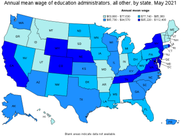
How Georgia Pays its Administrators Compared to Other States
Disclaimer: I got this visualization from the Bureau of Labor Statistics:https://www.bls.gov/oes/current/oes119039.htm
Links
Write-Up
In the dashboard, I have decided to highlight how teachers in Georgia are paid in relation to their county’s Public School CCRPI score in 2019. I have highlighted this relationship in my main visualization because a popular notion about education is that if a county has high test scores, then the salaries for the teachers tend to be higher. My goal for this visualization is to see if this notion is true or not and have some evidence to back my conclusion up. Also, I wanted to make this visualization into a dashboard format because I wanted to see if this trend would also be true for the salaries of administrators and support staff for each county. Since the points on the plot on the left look like a line going up and to the right, the idea that higher test scores leads to higher salaries in the various counties could be correct.
To add some context to the main visualization, I have added some plots to show to Georgia pays its teachers and administrators compared to other states. I also made sure to only include data from the 2020-2021 school year, as that is the time period the original dataset also records. To illustrate how Georgia pays its teachers compared to other states, I created a bar graph to show the relationship of the salaries of other states in relation to each other. I then highlighted the bar representing Georgia orange, so that it would be clear to the viewer as to which bar I am comparing my findings to, since orange and blue are opposite colors on the color wheel. I also added a green line at the value that represents the average annual salary from all of the states, so I can better see how Georgia pays its teachers compared to the national average. I decided to make this line a lighter green, so that it would contrast well from the blue and the orange. To illustrate how Georgia pays its administrators compared to other states, I used a plot that was created by the Bureau of Labor Statistics to highlight this.
Based on my findings, it seems that Georgia pays their teachers and administrators decently compared to other states. However, Georgia pays its teacher below the national average, since the height of the bar corresponding to Georgia is lower than the green line representing the average. According to the key of the graph from the Bureau of Labor Statistics, Georgia pays their administrators in the second highest range ($85,730 - $94,570). Considering these factors about Georgia from these two visualizations, Georgia could do better in paying its teachers and administrators. This is especially true when the viewer looks at how the teachers and administrators are being paid in individual counties compared to the national average.
Links
The links for the original source of the data, the csv file I was working with, and the jupyter notebooks are under the visualization they correspond to.